Solibri API - Code Example
UI Component Example
This example shows how to define a custom rule parameters UI for a rule. You can download the examples project from here.
Defining a parameters UI using the API components
The UI components included in the Solibri API are used for defining the layout of the UI components. In order to create a custom UI, the getParametersUIDefinition method declared in Rule needs to be overriden.
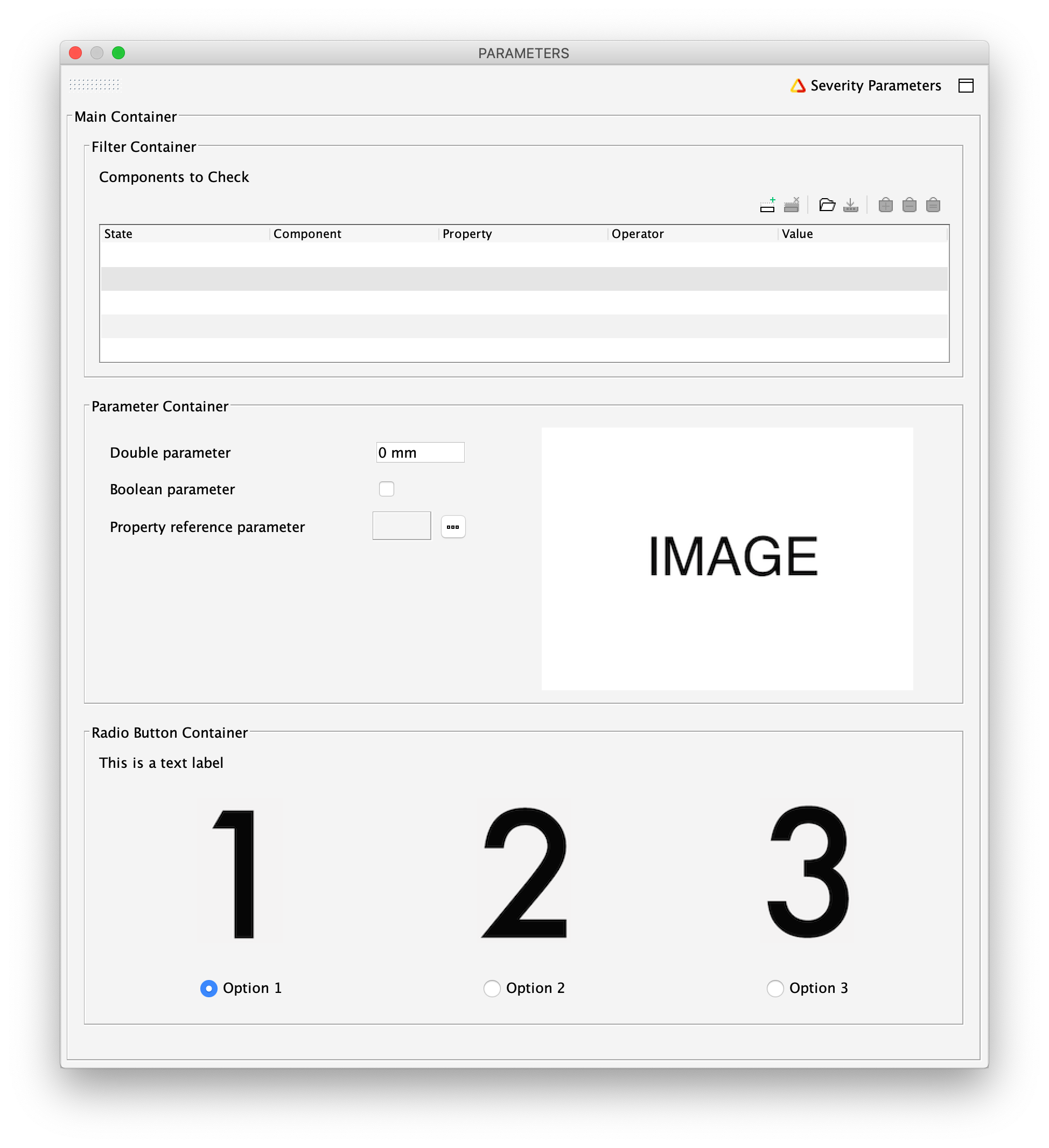
The example UI consists of three panels. The panels are handled using the container classes that can contain other UI components. Container can also be placed within other containers to create more complicated layouts. This is done in the middle panel of the example UI.
UIComponentExample.java
package com.solibri.smc.api.examples.beginner;

import java.util.ArrayList;
import java.util.Arrays;
import java.util.Collection;
import java.util.Collections;
import java.util.List;
import java.util.Optional;

import com.solibri.smc.api.checking.BooleanParameter;
import com.solibri.smc.api.checking.DoubleParameter;
import com.solibri.smc.api.checking.EnumerationParameter;
import com.solibri.smc.api.checking.FilterParameter;
import com.solibri.smc.api.checking.OneByOneRule;
import com.solibri.smc.api.checking.PropertyReferenceParameter;
import com.solibri.smc.api.checking.Result;
import com.solibri.smc.api.checking.ResultFactory;
import com.solibri.smc.api.checking.RuleParameters;
import com.solibri.smc.api.checking.RuleResources;
import com.solibri.smc.api.model.Component;
import com.solibri.smc.api.model.PropertyReference;
import com.solibri.smc.api.model.PropertyType;
import com.solibri.smc.api.ui.BorderType;
import com.solibri.smc.api.ui.UIContainer;
import com.solibri.smc.api.ui.UIContainerHorizontal;
import com.solibri.smc.api.ui.UIContainerVertical;
import com.solibri.smc.api.ui.UIImage;
import com.solibri.smc.api.ui.UILabel;
import com.solibri.smc.api.ui.UIRadioButtonPanel;
import com.solibri.smc.api.ui.UIRadioButtonPanelHorizontal;
import com.solibri.smc.api.ui.UIRuleParameter;

/**
 * This example shows how to define a custom layout for the rule parameters UI
 * of your own rules.
 */
public final class UIComponentExample extends OneByOneRule {

	/*
	 * Retrieve the parameters creator.
	 */
	private final RuleParameters params = RuleParameters.of(this);

	/*
	 * Get a reference to the default filter by using getDefaultFilter. This is the filter that is used for
	 * selecting which components are checked by the rule.
	 */
	private final FilterParameter componentFilterParameter = this.getDefaultFilterParameter();

	/*
	 * Create a parameter for handling double values.
	 */
	private final DoubleParameter doubleParameter = params.createDouble("rpDoubleParameter", PropertyType.LENGTH);

	/*
	 * Create a parameter for handling boolean values.
	 */
	private final BooleanParameter booleanParameter = params.createBoolean("rpBooleanParameter");

	/*
	 * Create a parameter for handling property references. Property references can be used for retrieving the
	 * value of a property from a component's property sets.
	 */
	private final PropertyReferenceParameter propertyReferenceParameter = params.createPropertyReference("rpPropertyReferenceParameter");

	private final EnumerationParameter enumerationParameterForRadioButtons = params.createEnumeration("rpEnumerationParameterForRadioButtons",
		Arrays.asList("rpEnumerationParameterForRadioButtons.OPTION1", "rpEnumerationParameterForRadioButtons.OPTION2",
			"rpEnumerationParameterForRadioButtons.OPTION3"));

	/*
	 * Retrieve a reference to the resources of this rule. The resources of a rule can contain
	 * resources such as strings and images.
	 */
	private final RuleResources resources = RuleResources.of(this);

	@Override
	public Collection<Result> check(Component component, ResultFactory resultFactory) {
		/*
		 * The values of the parameters can be accessed using the getValue
		 * method.
		 */
		Double doubleParameterValue = doubleParameter.getValue();
		System.out.println("The value of the double parameter is " + doubleParameterValue);

		Boolean booleanParameterValue = booleanParameter.getValue();
		System.out.println("The value of the boolean parameter is " + booleanParameterValue);

		PropertyReference propertyReference = propertyReferenceParameter.getValue();
		System.out.println("The name of the referred property is " + propertyReference.getPropertyName());

		/*
		 * Get the value of the referenced property from the component and print it if the value is present.
		 * If the component does not have the property specified by the reference, then the property value will
		 * be empty.
		 */
		Optional<?> propertyValue = component.getPropertyValue(propertyReference);
		if (propertyValue.isPresent()) {
			System.out.println("The value of the referred property is " + propertyValue.get());
		}

		/*
		 * The value of an enumeration parameter is the string key of the
		 * selected option.
		 */
		String enumerationParameterValue = enumerationParameterForRadioButtons.getValue();
		System.out.println("The value of the enumeration parameter is " + enumerationParameterValue);

		/*
		 * This rule does not produce results.
		 */
		return Collections.emptySet();
	}

	/**
	 * In order to create a custom parameters UI for your rule, the method
	 * {@link com.solibri.smc.api.checking.Rule#getParametersUIDefinition()} needs to be overridden.
	 */
	@Override
	public UIContainer getParametersUIDefinition() {
		/*
		 * Create the main container for the UI definition. The container has a
		 * title and a line border. The getString method is used to get the
		 * string value from the properties file of the rule.
		 */
		UIContainer mainContainer = UIContainerVertical.create(resources.getString("uiMainContainer.TITLE"), BorderType.LINE);

		/*
		 * Add a new container to the main container. Containers can be placed
		 * within other containers to create different layouts. mainContainer is
		 * a vertical container, so each new component is added below the
		 * previously added one.
		 */
		mainContainer.addComponent(createFilterContainer());

		/*
		 * Create and add a container with parameters and an image.
		 */
		mainContainer.addComponent(createContainerWithParametersAndImage());

		/*
		 * Create and add a container with a label and a radio button panel with images.
		 */
		mainContainer.addComponent(createContainerWithLabelAndRadioButtonWithImages());

		/*
		 * Return the container that contains all of the UI components for the parameters panel.
		 */
		return mainContainer;
	}

	/**
	 * This method creates the top panel of the parameters UI.
	 */
	private UIContainer createFilterContainer() {
		/*
		 * Add a container that contains just a FilterParameter.
		 */
		UIContainer filterContainer = UIContainerVertical.create(resources.getString("uiFilterContainer.TITLE"), BorderType.LINE);
		/*
		 * Rule parameters are added to the user interface by using
		 * UIRuleParameter objects.
		 */
		filterContainer.addComponent(UIRuleParameter.create(componentFilterParameter));

		return filterContainer;
	}

	/**
	 * This method creates the middle panel of the parameters UI.
	 */
	private UIContainer createContainerWithParametersAndImage() {
		/*
		 * This container uses horizontal layout to place a column of parameters
		 * next to an image.
		 */
		UIContainer horizontalContainer = UIContainerHorizontal.create(resources.getString("uiParameterContainer.TITLE"), BorderType.LINE);

		/*
		 * Create a vertical container without title of border.
		 */
		UIContainer parameterContainer = UIContainerVertical.create();

		/*
		 * Add different types of parameters into the parameter container.
		 * In a vertical container the UI component that is is added first will
		 * be placed topmost.
		 */
		parameterContainer.addComponent(UIRuleParameter.create(doubleParameter));
		parameterContainer.addComponent(UIRuleParameter.create(booleanParameter));
		parameterContainer.addComponent(UIRuleParameter.create(propertyReferenceParameter));

		/*
		 * Add the parameter container to the horizontal container. As the
		 * parameter container is added first, it will be at the leftmost side
		 * of the container in the UI.
		 */
		horizontalContainer.addComponent(parameterContainer);

		/*
		 * Create an image from the image URL and add it to the container. The
		 * image will appear on the right side of the parameters.
		 */
		UIImage image = UIImage.create(resources.getImageUrl(resources.getString("uiParameterContainerImage")));
		horizontalContainer.addComponent(image);

		return horizontalContainer;
	}

	/**
	 * This method creates the bottom panel of the parameters UI.
	 */
	private UIContainer createContainerWithLabelAndRadioButtonWithImages() {
		UIContainer radioButtonContainer = UIContainerVertical.create(resources.getString("uiRadioButtonContainer.TITLE"), BorderType.LINE);

		/*
		 * Create a simple text label and add it at the top of the container.
		 */
		UILabel textLabel = UILabel.create(resources.getString("uiRadioButtonContainer.LABEL"));
		radioButtonContainer.addComponent(textLabel);

		/*
		 * Enumeration parameters can be represented in the UI using radio
		 * buttons. Radio buttons can be placed horizontally or vertically and
		 * can contain images alongside the options. This example shows a radio
		 * button panel with three options in a horizontal layout and images.
		 */

		UIRadioButtonPanel radioButtonPanel = UIRadioButtonPanelHorizontal.create(enumerationParameterForRadioButtons);

		/*
		 * The enumeration parameter has three possible options for values, so
		 * three images are needed. The first image is the one that is attached
		 * to the first option, the second image is attached to the third option
		 * and so on.
		 */
		List<UIImage> radioButtonImages = new ArrayList<>();
		radioButtonImages.add(UIImage.create(resources.getImageUrl(resources.getString("rpEnumerationParameterForRadioButtons.IMAGE1"))));
		radioButtonImages.add(UIImage.create(resources.getImageUrl(resources.getString("rpEnumerationParameterForRadioButtons.IMAGE2"))));
		radioButtonImages.add(UIImage.create(resources.getImageUrl(resources.getString("rpEnumerationParameterForRadioButtons.IMAGE3"))));

		/*
		 * Add the images to the radio button panel.
		 */
		radioButtonPanel.addOptionImages(radioButtonImages);

		radioButtonContainer.addComponent(radioButtonPanel);

		return radioButtonContainer;
	}
}
UIComponentExample.properties
The properties that are used in the UI are defined in the properties file.
DEFAULT_NAME=UI Component Example
DEFAULT_DESCRIPTION=This rule displays different types of parameter UI components
AUTHOR=Solibri, Inc.
AUTHOR_TAG=SOL
UID=EX5
VERSION=1.0
DATE=2018-12-21

uiMainContainer.TITLE = Main Container
uiFilterContainer.TITLE = Filter Container

rpComponentFilter.NAME = Components to Check
rpComponentFilter.DESCRIPTION = This filter specifies the set of components to check.

uiParameterContainer.TITLE = Parameter Container

rpDoubleParameter.NAME = Double parameter
rpDoubleParameter.DESCRIPTION = Double parameter tooltip
rpDoubleParameter.DEFAULT_VALUE = 0

rpBooleanParameter.NAME = Boolean parameter
rpBooleanParameter.DESCRIPTION = Boolean parameter tooltip
rpBooleanParameter.DEFAULT_VALUE = false

rpPropertyReferenceParameter.NAME = Property reference parameter
rpPropertyReferenceParameter.DESCRIPTION = Property reference parameter tooltip

uiParameterContainerImage = images/image.png

uiRadioButtonContainer.TITLE = Radio Button Container
uiRadioButtonContainer.LABEL = This is a text label

rpEnumerationParameterForRadioButtons.NAME = Radio button
rpEnumerationParameterForRadioButtons.DESCRIPTION = Radio button tooltip
rpEnumerationParameterForRadioButtons.DEFAULT_VALUE = 0
rpEnumerationParameterForRadioButtons.OPTION1 = Option 1
rpEnumerationParameterForRadioButtons.OPTION2 = Option 2
rpEnumerationParameterForRadioButtons.OPTION3 = Option 3

rpEnumerationParameterForRadioButtons.IMAGE1 = images/radio_button_1.png
rpEnumerationParameterForRadioButtons.IMAGE2 = images/radio_button_2.png
rpEnumerationParameterForRadioButtons.IMAGE3 = images/radio_button_3.png